As a pretext to write a meaningful blog post, I wanted to go back to one of my recent little hacks.
There was a race, MalmöMilen, which happened on June 14, 2014. But before actually going to the race, I wanted to know what the distribution of the participants into the different start groups was.
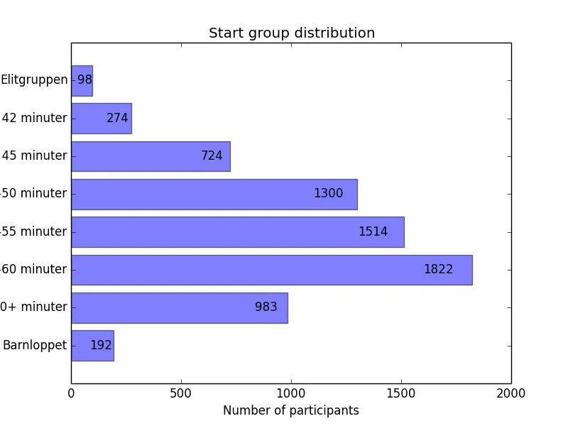
I had registered myself in the 50-55 minutes start group, but I knew I would do less than 44 minutes (yes that was a stupid choice). The question then was to know how many runners (roughly) will be positioned before and that I will have to overtake.
The simple solution was to use an Jupyter Notebook and do some data scraping, directly using the data from their website. Code (pretty short and simple) and graph follow.
from bs4 import BeautifulSoup
import requests
import json

url = 'http://www.malmomilen.se/anmaelan/startlista-2014'
page = requests.get(url)
soup = BeautifulSoup(page.text)
table = soup.body.table.find_all('tr')

ps = {}
for line in table:
    c = line.find_all('td')
    time = c[4].text if c[4].text != '' else 'N/A'
    if time not in ps:
        ps[time] = 0
    ps[time] += 1

print("There are " + str(len(table)) + " participants")
This is how we get the number of participant and group them by start time.
The following illustrates how to visualize the distribution on a nice graph.
%matplotlib inline

import matplotlib.pyplot as plt; plt.rcdefaults()
import numpy as np

sorted_groups = ['Elitgruppen', 'Under 42 minuter', 'Under 45 minuter', '45-50 minuter',
                 '50-55 minuter', '55-60 minuter', '60+ minuter', 'Barnloppet']
groups = [g[:8] for g in sorted_groups]
y_pos = np.arange(len(groups))[::-1]
n = [ps[group] for group in groups]

rects = plt.barh(y_pos, n, align='center', alpha=0.5)
plt.yticks(y_pos, sorted_groups)
plt.xlabel('Number of participants')
plt.title('Start group distribution')

for i, rect in enumerate(rects):
    plt.text(0.95 * rect.get_width(), rect.get_y() + rect.get_height() / 2.0, ps[groups[i]], ha='right', va='center')

plt.show()
Which plots the following graph:
Now that the race is finished and results are out, I really want to play with the available data and make it say something.
Next time!